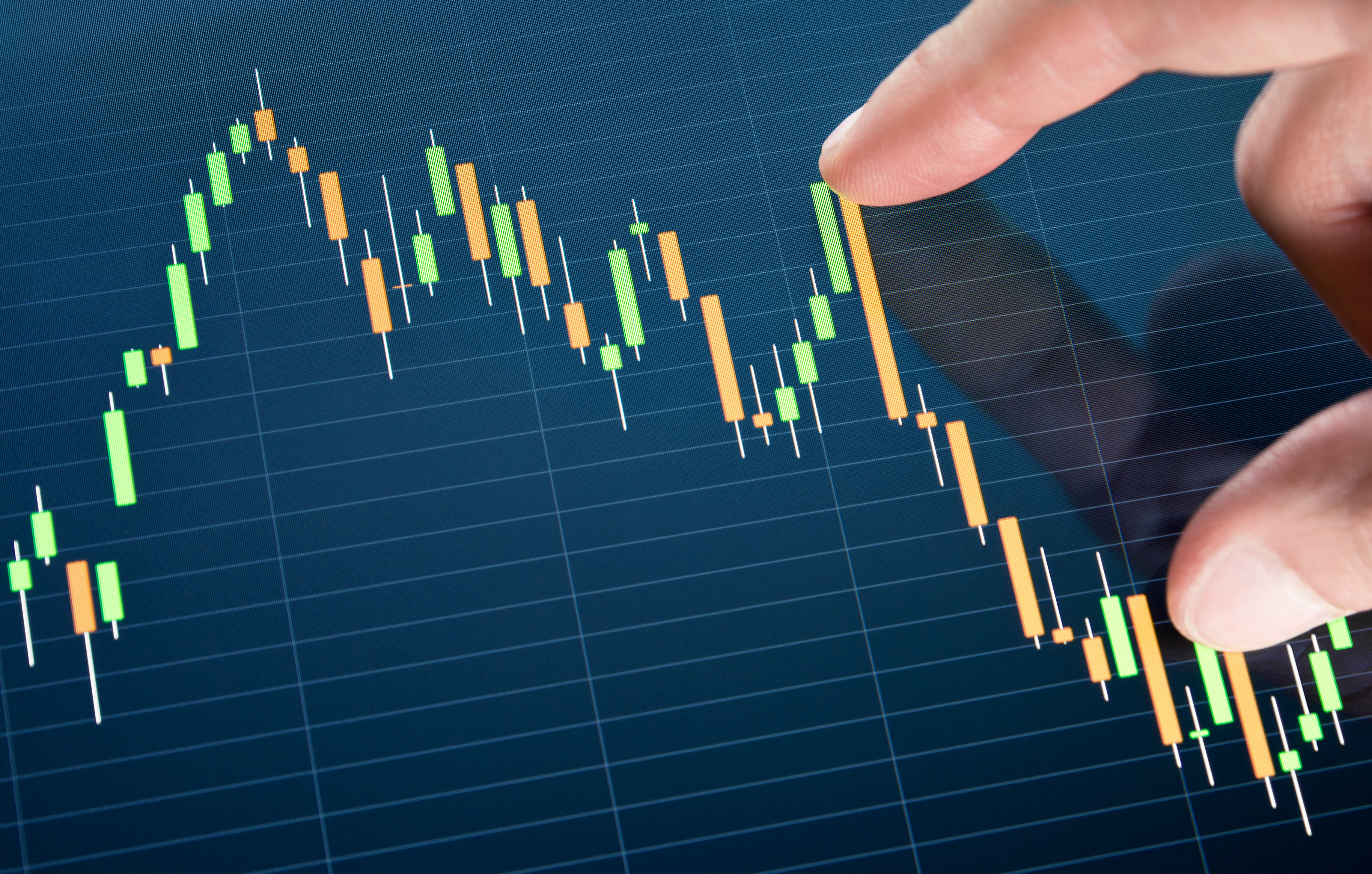
Intraday price charts are used by many traders to monitor activity over a specified period of time. This can be done in intervals of 5, 15 or even 60 minutes. The system will track the movement over this time and present each interval as a bar, such as candlestick or open-high-low-close (OHLC). For this type of tracking method, time is the only factor under consideration and will produce the same number of bars each day as long as the intervals are the same.Another type of chart used is a data chart, whereby intervals are set according to data rather than time. This allows traders to monitor price activity over a certain data range rather than a specified amount of time. There are three types of charts that investors generally use to measure market volatility:
When used correctly, these three charts can all form part of effective trading strategies.
Tick charts
By using tick charts, traders can monitor market activity and gain data to analyse price movements. The chart reflects a number of transactions per bar, which allows traders to track the busier and slower times. The chart can be set to print a bar after various transactions. Therefore, when the market is very active, more bars will print, and when the market is quiet, fewer bars will print. By observing how often bars are printed and how many in a set time, traders can carefully track market activity and make more informed judgements. Through this, market volatility can be seen at any given time. Numbers from the Fibonacci sequence will be used for the intervals, such as 144, 233 and 610 ticks per bar.
Volume charts
Volume charts represent the amount, or volume, of shares that have been traded. It is similar to tick charts in the sense that the activity of the market can be monitored based on the number of bars that are printed and how regularly they are printed. The volume of shares is set, and once that volume is reached, regardless of the size of the transactions, the bar will print. Each market will represent the volume of its relevant trading symbol. For example, shares will be monitored when trading in stocks, contract when trading in commodities and lot sizes when monitoring forex trading. The set volume will vary depending on the type of symbol that has been set, such as one for larger intervals for securities that trade at a higher volume. This allows traders to track the relevant information for their trades.
Range bar charts
Traders can monitor market volatility by using a range bar charts, which track price changes. The intervals can be set for a determined amount of price changes, for example ten, and a bar will print after ten changes have occurred. An added benefit of range bar charts is that, during periods of consolidation, fewer bars will be printed. This allows traders to monitor entries more precisely than with a time-based chart.
Data charts are advantageous because traders can monitor a broader range of factors in the markets other than just time. While time can reflect many important changes, adding factors like price changes, volume of transactions and number of transactions to a trader’s methodology provides a greater knowledge, thus giving a competitive edge. Each trader will set up charts to suit their trading method and chosen market, and then analyse the charts as they are produced to better understand market volatility and plan strategic trades.